Where Design is Heading
Apple has long been a driving force (or just a leading indicator) of global design trends.
In the 80s, it was all about technicolor and gay rights. Since the advent of Web 2.0, it has been about rounded corners and drop shadows and shiny glossy lens flares.
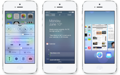
Based on iOS 7 previews, the next big thing will be rainbow gradient geometric shapes. Like Flatland* on an acid trip.
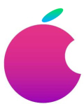
Maybe it’s time for a new Apple logo. Here, I’ll do it for you Jony.
*I never liked Flatland. In a truly 2-dimensional world, the shapes should have been invisible to each other.


